Commuters on public transport are acutely aware of deviations from expected values. Plane departures, for example. How many planes depart on time? And how can you make that statistic vivid?
One way is to visualise each plane’s deviation from the schedule. Here is a graph of three days when 83% of planes departed on time. It uses ggstraw::geom_straw().
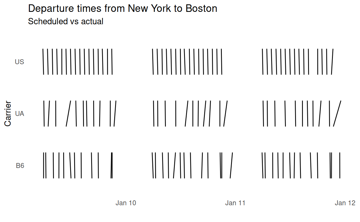
That graph shows every plane departure, not just a summary statistics. Each departure is a near-vertical line that slopes from the scheduled departure time at its base on the x-axis to the actual departure time at its tip above the x-axis. The neat vertical lines of the carrier “US” are comfortable to read, whereas the awkwardly sloped lines of the carriers “UA” and “B6” are uncomfortable to read and demand attention. This reflects the fact that the uncomfortable sloping lines indicate late flights, deviations from the expected schedule.
Early flights would also be uncomfortable to read and demand attention. I think that is also desirable, particularly in forms of transport that abandon passengers by departing early, such as trains and buses.
Because every plain departure is shown, they are easy to relate to. You can see what time of day planes were late, to help you decide which time of day to fly. You can also get a feel for how late the planes were.
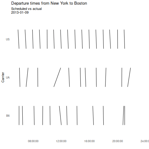
Thanks to ggplot2’s magical extension system you get things like animation for free.
Another use is to show when ‘fast’ trains overtake ‘all-stations’ trains. Here we put the scheduled start time at the bottom of each straw, and the scheduled arrival time at the top. Crossed straws draw the eye to the overtakes. Here is a plot of part of the London Underground Metropolitan Line timetable.
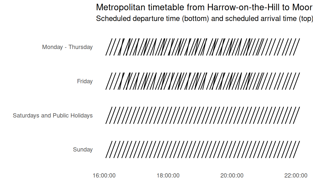
Look again and you might notice a gap in arrivals at about 19:15 on weeknights. That one often catches me out – for some reason several trains in a row take a different branch, to Uxbridge, while commuters travelling towards Moor Park, Amersham, Chesham and Watford pass the time writing blog posts about R.